If you’re a business owner, you don’t need another “pretty website.” You need a website that creates trust fast, answers the right questions, and turns attention into leads or sales. In 2026, “good” is no longer a subjective opinion, it’s measurable. Visitors judge you in seconds, Google evaluates experience signals, and paid traffic punishes slow or confusing pages. This checklist breaks “good” into four practical pillars: strategy, UX/UI, performance and trust, and measurement. For service businesses, small improvements compound into more qualified leads over time.
A quick note on question-style titles: they can improve clarity and click-through rate when they match search intent, but they don’t magically boost rankings on their own. Use a question when it reflects what the reader is searching for, and keep it specific.
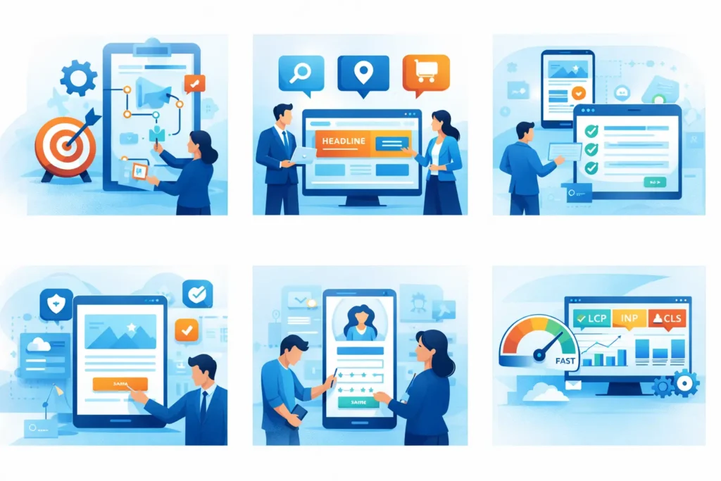
Define your funnel. For most service businesses, the funnel is: traffic source → landing page → proof → offer → contact form or booking → follow-up. For ecommerce, it’s: category page → product page → cart → checkout. Map these paths on paper, then build pages that support each step.
Clarify user intent. Visitors arrive with one of three mindsets: informational (“Can you solve my problem?”), navigational (“Are you the right company?”), or transactional (“I’m ready—how do I buy or book?”). Your content should match that intent. If someone searches “website redesign cost,” they need pricing ranges and factors, not a generic agency pitch. If they search your brand name, they need credibility, contact options, and a clear explanation of services.
Checklist: strategy essentials
One primary goal per key page (home, services, landing pages).
Clear audience definition (industry, location, budget range, decision-maker).
A documented offer (what you do, for whom, and what outcomes to expect).
A content map that supports the funnel (awareness → consideration → action).
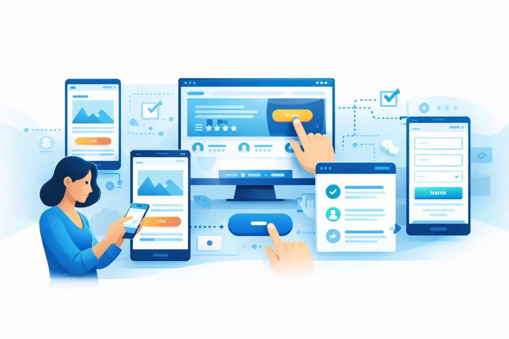
In 2026, UX is your competitive advantage because most sites still frustrate users. “Good” UX means people can complete tasks quickly: understand what you do, find proof, and take the next step, especially on mobile.
Start with clarity in the hero section. Within one screen, a visitor should know: (1) what you do, (2) who it’s for, (3) the main benefit, and (4) what to do next. Use a short headline, one supporting sentence, and one primary call-to-action (CTA). A secondary CTA is fine, but don’t offer five buttons.
Create a predictable layout. Keep navigation simple (5–7 items), use consistent spacing, and place CTAs in familiar spots. For service pages, follow a proven flow: problem → solution → process → proof → pricing guidance → FAQ → CTA. For landing pages, reduce navigation and keep message-match with the ad.
Design for mobile first. Most business traffic is mobile, and Google primarily uses mobile content for indexing. Mobile UX basics include readable font sizes, tap targets that aren’t cramped, and forms that don’t feel like paperwork. If your form has more than 6–8 fields, consider splitting it, using conditional fields, or offering a booking link instead.
Build trust with UI details. “Good” UI is not decoration; it supports understanding. Use strong visual hierarchy (headings, subheadings, bullets), high contrast for readability, and consistent typography. Add proof elements near CTAs: reviews, client logos, case study snippets, security badges for checkout, and clear contact info.
Checklist: UX/UI essentials
A hero that explains value in 5 seconds.
One primary CTA per page section.
Mobile-friendly forms (short, clear labels, helpful error messages).
Social proof placed where decisions happen.
FAQs that remove objections and reduce support load.
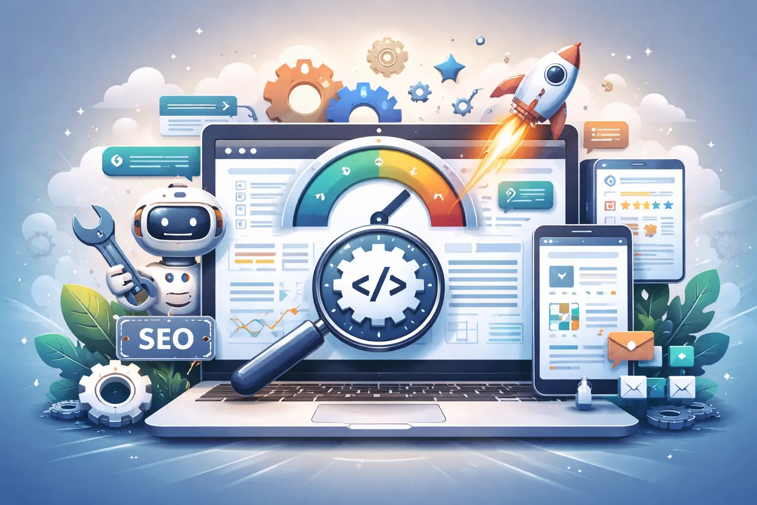
A “good” website feels fast and safe. Performance affects user patience, conversions, and SEO. Start by measuring with Google PageSpeed Insights and Lighthouse. These tools highlight issues such as slow largest content, long JavaScript tasks, and layout shifts. Focus on improvements that change user experience, not just a score.
Prioritize Core Web Vitals. In practical terms:
LCP (Largest Contentful Paint) is the “main content appears” moment.
INP (Interaction to Next Paint) reflects responsiveness when users tap or click.
CLS (Cumulative Layout Shift) captures page “jumping” and visual instability.
When these are poor, users lose trust—even if your design looks great.
Common performance wins for business sites:
Compress and properly size images (especially hero images).
Use modern formats (WebP/AVIF) and lazy-load below-the-fold media.
Reduce heavy plugins and unused scripts; defer non-critical JavaScript.
Optimize fonts (limit families, use font-display, preload key files).
Improve hosting, caching, and CDN configuration.
Security and reliability are non-negotiable. Use HTTPS everywhere, keep your CMS and plugins updated, and set up backups. For lead generation sites, protect forms from spam with rate limiting or lightweight anti-spam tools. For ecommerce, display security and return policy information clearly.
Credibility signals make performance matter more. Visitors ask: “Is this business real, and can I trust them with my money?” Add real photos, team names, a physical address if relevant, a clear privacy policy, and visible contact options. Case studies with measurable outcomes (even small ones) are powerful: “Reduced bounce rate by 18%” or “Improved PageSpeed performance from 22 to 78.”
Checklist: performance & trust
Run PageSpeed Insights on key templates (home, service, landing).
Fix top blockers: images, scripts, fonts, and layout shifts.
HTTPS, backups, updates, and uptime monitoring.
Proof: reviews, case studies, clear policies, and real contact details.
Bonus: Content Quality Signals That Support SEO and Trust
Even the fastest site won’t convert if the content feels generic. In 2026, “good” content is specific, credible, and written for real decision-makers. Upgrade your service pages with clear deliverables, timelines, and “who it’s for” statements. Add a short “How we work” section so buyers know what happens after they submit a form. Use FAQs to answer pricing, turnaround, revisions, and guarantees—these reduce sales friction and can match the exact questions people type into Google.
Support your claims with evidence. If you mention results, include a mini case study, a testimonial, or a before/after metric. Add credibility signals like a team page. Finally, connect content to intent: informational blog posts should link to the relevant service page, and service pages should link back to deeper guides (like PageSpeed or UX). Internal linking helps users and Google.
A website is only “good” if it improves when you learn. Measurement turns guesswork into decisions. Start with clean analytics: GA4 installed correctly, conversion events set up, and spam filters applied. If you run ads, ensure your tracking matches your campaign goals.
Conversions: form submits, calls, bookings, purchases.
Conversion rate: percent of visitors who take action.
Lead quality signals: booked appointments, qualified form fields, revenue.
Engagement: scroll depth, time on page, key button clicks.
Technical health: Core Web Vitals, uptime, crawl errors.
Use attribution wisely. GA4 will not perfectly “credit” every channel, but it will show patterns. Combine analytics with simple operations data: “Where did you hear about us?” and CRM tags. If you can connect revenue to sources, you can scale what works.
Review conversions and drop-off points.
Check top landing pages and their intent match.
Review PageSpeed/Core Web Vitals for key pages.
Make one focused change (copy, CTA, speed fix, form simplification).
Measure impact for 2–4 weeks, then iterate.
GA4 + Search Console + conversion events.
A simple dashboard for leads and revenue signals.
Monthly review and one priority improvement at a time.
Document changes so you know what caused results.
Putting It All Together: The “Good Website” Snapshot
A modern business website in 2026 is a system: strategy guides the pages you build, UX/UI reduces friction, performance and trust remove doubt, and measurement keeps growth moving. If you want a quick self-audit, use this one-page test:
Can a new visitor understand what you do in 5 seconds?
Can they take the next step in 2 clicks or less?
Does the page feel fast, stable, and secure on mobile?
Do you have proof near the decision points?
Are conversions tracked so you can improve the site every month?
If you answer “no” to two or more, your site isn’t “bad”—it’s simply under-optimized. That’s good news, because the fixes are measurable and the ROI is real. A focused checklist and a short action plan can turn your website from an online brochure into a consistent growth channel.
Share on:
Discover More Insights


Join our newsletter to receive the latest updates in technology and marketing trends straight to your inbox. Stay informed and take the lead
