Most business owners open a PageSpeed Insights (PSI) report, see a number like 52 or 88, and immediately ask the wrong question: “How do I get to 100?” The pro question is: “What is PSI telling me about real user experience, and what should I fix first to increase leads?”
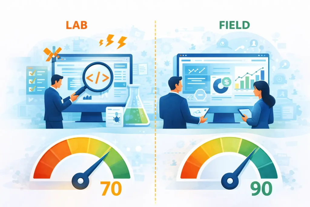
Google’s PageSpeed Insights is powerful because it combines two different types of performance data in one place:
Field data (real-user experience from Chrome UX Report / CrUX)
Lab data (a controlled Lighthouse test)
If you learn to read PSI properly, you’ll stop chasing vanity scores and start turning the report into a practical action plan that improves conversions, SEO stability, and ad performance. PSI itself explains it uses both lab and real-world data, with real-world data coming from CrUX.
Below is a step-by-step way to read every PSI section like a pro, without getting lost in jargon.
This top section is the one that matters most for business outcomes because it reflects what actual visitors experienced over time—not one single test run.
PSI’s field section comes from CrUX, which is a collection of real-user experiences (“from the field”).
Field data is typically shown as:
A Pass/Fail “Core Web Vitals Assessment”
A 75th percentile value for each metric
A distribution (percentage of “Good / Needs Improvement / Poor”)
That 75th percentile detail is critical: field scores represent a point in a distribution, not “your average user.” Web.dev explains that field data is a distribution across many devices, networks, and behaviors, and that tools reporting field CWV generally use the 75th percentile.
Pro tip: If you have field data, use it to prioritize work. Web.dev’s general rule: field data is the most accurate way to understand what real users struggle with; lab data is great for debugging and testing improvements.
The Lighthouse lab section runs a controlled test. PSI’s CrUX guide explains: CrUX = field, Lighthouse = lab.
Lab data is valuable because it:
Is repeatable and consistent
Shows “Opportunities” and “Diagnostics”
Helps your developer reproduce issues and verify fixes
But lab data can disagree with field data, and that’s normal. Web.dev has a full guide explaining why lab and field can differ, even for the same page—because they measure different things under different conditions.
How to read it like a pro:
Field data answers: “Is this hurting real users?”
Lab data answers: “What exactly is causing it and how do we fix it?”
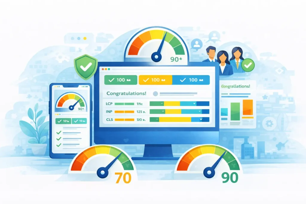
The Lighthouse performance score uses these ranges:
0–49 (red): Poor
50–89 (orange): Needs improvement
90–100 (green): Good
So a 70 isn’t “close to 90.” It’s still in the “needs improvement” range.
Lighthouse scoring isn’t linear. The Chrome team explains Lighthouse uses a log-normal scoring curve based on real-world performance data (HTTP Archive). The 25th percentile maps to score 50, and the 8th percentile maps to score 90.
That means:
Score 90 already represents top-performing sites.
Pushing above ~96 hits “diminishing returns,” requiring increasingly more improvement for tiny score gains.
A “perfect 100” is extremely challenging and not expected.
Business interpretation (what you should tell clients):
70 = you likely have real issues (especially on mobile) that can reduce conversions.
90 = you’re in a strong zone; focus on stability and real-user CWV, not score-chasing.
100 = not a business goal—only pursue if it aligns with ROI and doesn’t sacrifice marketing needs.
PSI often shows separate scores for:
Performance
Accessibility
Best Practices
SEO
Your business outcome usually depends most on Performance + UX stability, but accessibility and best practices also influence trust and usability.
Core Web Vitals are the “experience” metrics that matter most. PSI’s CrUX guide lists the 3 CWV metrics first and explains what they mean.
LCP measures how long it takes until the page displays what is likely the main content, often a hero image or headline.
Thresholds in PSI:
Good: 0–2.5s
Needs improvement: 2.5–4.0s
Poor: 4.0s+
Plain English: If your hero section is slow, the visitor feels like the site is slow, even if everything else loads later.
INP measures interactivity by looking at the latency of user interactions and reporting a value that nearly all interactions are below.
Thresholds in PSI:
Good: 0–200ms
Needs improvement: 200–500ms
Poor: 500ms+
Plain English: If users tap “Book a Call” and the page feels laggy, your site is losing trust and conversions. read more
CLS measures layout instability caused by shifts like async content being injected.
Thresholds in PSI:
Good: 0.00–0.10
Needs improvement: 0.10–0.25
Poor: 0.25+
Plain English: Page “jumping” causes mis-clicks, frustration, and lower form submissions.
PSI says to pass, the 75th percentile must be “good” in all three CWV metrics (LCP, INP, CLS). Otherwise, the assessment is “failed.”
Pro move: Don’t just look at the single percentile value—click “Expand view” and check the distribution. A site might “pass” but still have a meaningful percentage of poor experiences on certain devices.
A good PSI report isn’t one that “looks pretty.” It’s one that supports business growth with stable user experience.
For lead-gen and service businesses, a healthy PSI snapshot typically means:
Core Web Vitals Assessment: PASS (Field)
LCP and CLS clearly in the green, INP also green or improving
Lighthouse Performance score preferably 90+, but not at the expense of marketing tools (chat, analytics, pixels)
And remember: Google’s own guidance emphasizes Core Web Vitals as real-world experience metrics (loading, interactivity, visual stability).
This is common. Web.dev notes lab might report a low score even if field data is good. read more
In that case:
Don’t panic.
Use lab diagnostics to make improvements that expand reach to slower devices/networks (without breaking what’s working).
Avoid risky changes that might harm conversions.
Also common (especially if you tested from a fast network). When this happens:
Treat Field data as priority (real users are suffering). read more
Consider that your users may be on slower phones, worse networks, or further from your server.
Look at server response (TTFB), caching/CDN, heavy scripts, and image delivery.
When you open any PSI report, do this in order:
Look at Field: Pass/Fail Core Web Vitals Assessment
Check LCP/INP/CLS percentiles and their colors
Open distribution to see how many users still have poor experiences
Then use Lighthouse “Opportunities” to find what’s causing the issues (images, JS, fonts, caching)
The fastest way to get value from PageSpeed Insights is to stop treating it like a “scoreboard” and start treating it like a decision tool:
Field data tells you what real users are experiencing.
Lab data tells you what to fix and how to validate improvements.
“70 vs 90” isn’t a small gap, and chasing 100 is usually not worth it.
The real goal is stable Core Web Vitals, especially on mobile.
Share on:
Discover More Insights


Join our newsletter to receive the latest updates in technology and marketing trends straight to your inbox. Stay informed and take the lead
